 This week, I’ve been putting out articles on Interview Ecology, and exploring the risks and benefits of introducing the “new and shiny” into the process. We’ve considered whether bringing a iPad into an interview is akin to bringing an invasive species into an eco-system.
This ecosystem approach relies heavily on the idea that anything that distracts or disrupts may destroy the delicate balance of a search process, and bring up dissonance in respect to person-environment fit, resulting in a candidate not getting a particular position.
Which forces me to bring up a particular pet peeve of mine: the all-the-sudden popular and ugly-as-sin QR code. I hate them, because like many fads, most people rushing to use them don’t understand how to make sure they add value to the experience. In general, I feel that most people might as well take a poop on their résumé as put one of these on it, because adding a QR code without adding something of value to the “interview ecosystem” is well…just a load of crap.
I’m already anticipating the response from candidates and tech geeks who think these things are cutting edge and allow a new layer of interactivity that wasn’t possible before. Well, I call bullshit. Scanning these blotches into a smartphone just allows lazy people to avoid typing a URL into their browser, as if the 20 seconds of time spent doing so will add up, like all the partial pennies Richard Pryor dumped into his bank account in Superman III, and will result in the résumé screener having a richer, more exciting , and complete view of the candidate.
Bullshit. Bullshit. BULLSHIT.
The same can be achieved by pointing someone toward a regular URL or hyperlink. QR codes only add new functionality to a paper résumé, which you probably aren’t viewing anyway. And anyone with half a salt lick of sense in their head can run a long URL into an URL shortener. So if space on the résumé is your major concern, that’s no argument, either.
Now, I will admit upfront to being a résumé geek and a purist. I don’t believe all the hogwash people throw around about résumés going away. Advances in technology and social media are just changing how they are delivered. And nothing takes away from the basic truths at play:
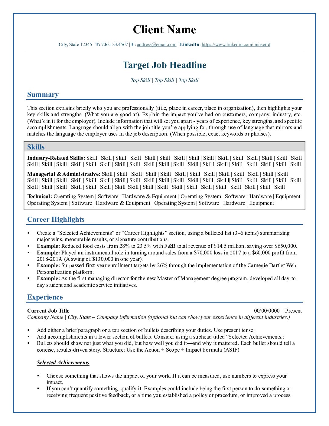
- Your résumé needs to be targeted toward your industry, level of experience, and the level of position you are seeking.
- It needs to be scannable (visually scannable)
- There has to be a sense of logical and visual flow that draws a reader in, and keeps them reading and scanning. And…here’s the big one…
- It needs to be attractive and not full of distracting bullshit.
I had a client recently work with me on his CV and he had a QR code on it, at top right. I asked him why it was there. He replied that he wanted to show himself as cutting edge and tech savvy. So I asked him where the QR Code goes, and what value was added by putting it on there. And…wait for it…it went to an online pdf copy of his CV!
We talked a bit and I told him I didn’t see the point of having it there, if it only went to his CV. He was really tied to keeping it there, so we came to a compromise position. He had also been updating his LinkedIn profile, which had some great recommendations on it, and some other links to relevant information. So we decided to point it there, because doing so added some value to the equation. The result: the QR code went from being poop on his résumé to being rich compost instead.
My criticism of his strategy should not be equated with a critique his level of technical savvy or his readiness for the type of job he was applying for, and I’ve told him as much. In fact, I think he’s a great candidate, or I wouldn’t be working with him. I don’t work with clients I don’t believe in, because that’s not fair to people on either side.
Ultimately, I’m grateful for the perspectives his situation has given me, and what it allows me to share with you.
Here are the big take-aways:
- New technology is great, and showing comfort with it is just fine. But using tech badly could actually hurt your candidacy. Make sure that your use of technology is appropriate and that there is a clear point to using it (like adding interactivity or pointing to recommendations or portfolio work.)
- If using a new way of doing things distracts from your design, content or flow, you really need to weigh the risks of using it against the value added. And if you can’t do this on your own…
- It pays to talk this sort of stuff out with a trusted friend, advisor, or career coach.
What do you think? Tell me in the comments.
Did You Enjoy This Post?
- Please take my reader survey and tell me what you think about Higher Ed Career Coach. It’s 11 questions and shouldn’t take long. Also, SurveyMonkey will be selecting one recipient at the end of June to receive a $25 Amazon gift card. So give your feedback and get a chance to win!
- Please like the Cook Coaching Facebook page and join the career discussion boards there!
- Follow Higher Ed Career Coach on Twitter
- Connect with me on LinkedIn
- Sign Up for our mailing list and get early announcements about upcoming site features, workshops and coaching specials.
- If you are interested in one of the upcoming summer groups or workshops, follow the links below.


